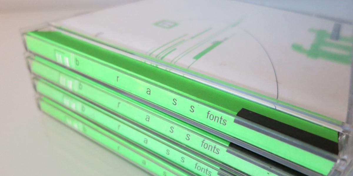
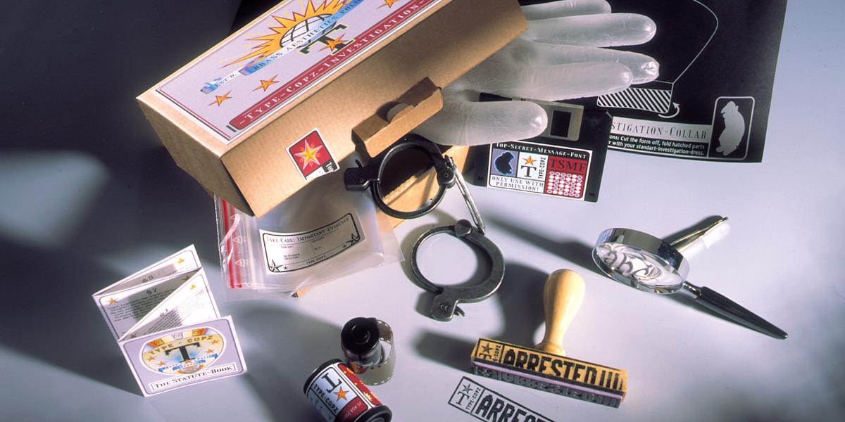
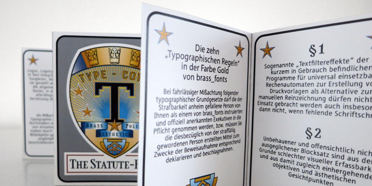
From the beginning, BrassFonts defined itself as an independent foundry, as a stylistic corrective.
In this spirit, many unique, experimental typefaces have been created, whose form has always followed a content-related idea.
Even if they seem a little out of date today, one can say: Good things remain!
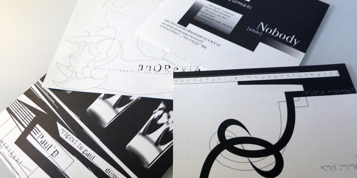
Paul’D
→An experimental homage to a great type design teacher.
Corpa Serif
→The slab serif variant of the popular, characterful and condensed BF Corpa Gothic
Solo Sans
→A constructed sans serif with intuitive details and forms!
Stoneman
→Brutal and bulky round blockbuster.
Matula
→Hybrid design of traditional serif typefaces and geometric, rounded sans serifs.
Fluxgold
→Compact styled slab serif, inspired by wood types as well as historical metal letters in industrial facilities and machine plaques.
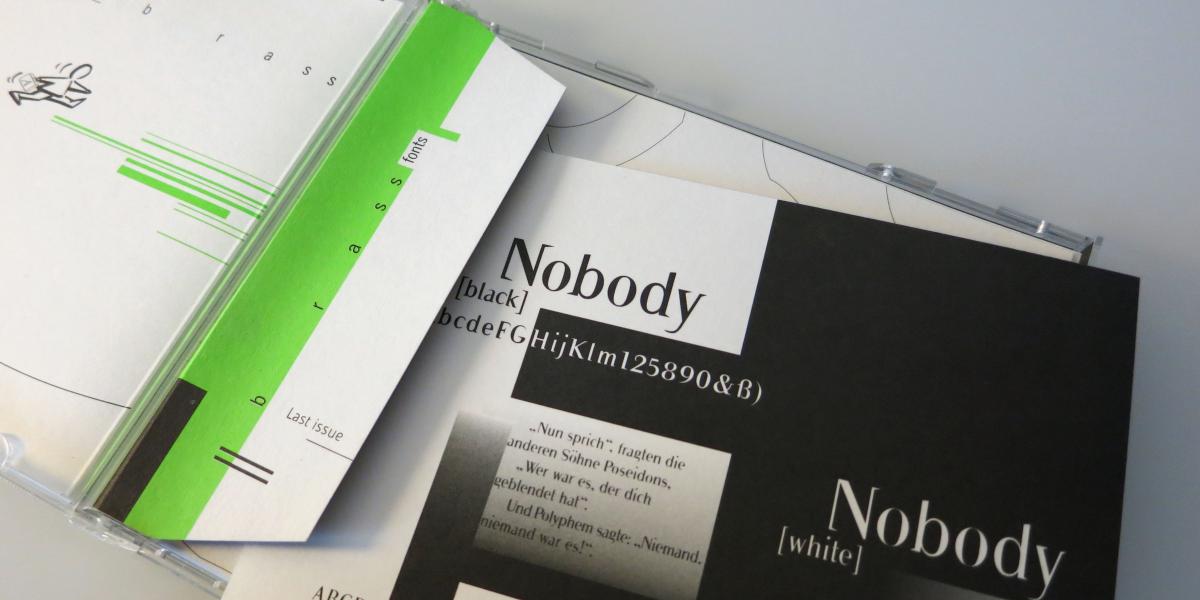
Nobody
→An experimental interpretation of Bodoni’s works.
Jaruselsky
→Decorative. Constructed. Ornamental. Contradictory.
SubZero
→Typographic experiment with a view to reduction and legibility
Anorexia
→If fat seems thin and skinny is too fat ...
